Discover Travel Affiliate Programs
Explore, compare and review programs to find your best match.


Banner advertising is one of the most effective ways to draw the attention of an audience. With banners, you can sell goods and services, redirect to partner sites, increase brand awareness, and more. To understand how to create effective banner ads, it is important to study the psychology of the buyer, think through the design and call to action, and analyze the effectiveness of advertising thoroughly. In this post, we’ve collected some of the best tips to teach you how to make a good banner.
Banner design significantly affects its visibility and attractiveness. Here are the things that most successful banner ads have in common:
Next, we’ll show you how to make banner designs better from a technical point of view.
Banners are attractive blocks of various sizes containing an advertising image and text. The combination of visual and textual components increases the impact on the visitor.

In scientific terms, this happens due to the increased processing speed of visual information by the human brain. Just 13 milliseconds are enough for full perception. Therefore, the introduction of graphic triggers is essential for successful advertising campaigns.
Below we’ll dwell on each component of a successful banner.
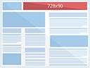
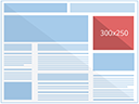
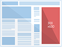
The effectiveness of banner ads depends on the correct banner size. According to the studies, an ad with a size of 468 × 60 px has a 0.04% click-through rate (CTR), while the banner formats 250 × 250 px and 336 × 280 px are four times (0.016% CTR) and nine times more effective.
You can conduct your A/B tests to find out what banner size converts better into sales. However, at first, it is better to stick to standard formats:

By choosing the right background, you’ll make your banner stand out from the rest of the page and draw attention. It can be either solid or multicolor or even be a photo, as long as the text on the ad is clearly visible:
Do not overload ads. It is better to use no more than 3-5 shades combined with each other, or two contrasting options. For users, each color evokes its own associations, therefore, depending on what emotions you want to evoke in your audience, choose the appropriate colors.
| Color | Associations | Be careful |
| Red | Speed, urgency (sale, fast food)Movement, dynamics, risk (Ferrari color)Passion and love (wedding rings, adult subjects)High fever (painkillers and antipyretic drugs) | Excess red causes irritation and aggression. |
| Orange | Sweet, sunny, active, (sweets, drinks, travel agencies)Healthy (children’s vitamins and medicines in general)Low price (shops of cheap goods)Dark shades – warmth, comfort (autumn offers, household items) | Orange color is not suitable for advertising premium products and for “serious” topics. |
| Yellow | Gives the subject intelligence (hi-tech theme)Associated with creative (advertising agencies, developing schools)Associated with natural foods rich in carbohydrates (cereals, flour, nuts, honey) | Energetic yellow color causes or intensifies headaches up to nausea. For advertising an anesthetic it is better not to risk it with a yellow banner. |
| Green | Safe start (from kindergartens to investments)Health (medical facilities and medicines)Calm, attention (green works well as a background color, it removes the overall level of tension and improves focus)The right choice, true information | Green is not suitable for advertising sweets, because it is associated with sour or bitter. |
| Blue | Pushes the space, creates a feeling of lightness in design both for the background and in the active elementsConveys weightlessness, freshness, and pleasant coolness (cosmetics and perfumes)Peace, tranquility, trust, reliability, harmony | Stereotypical choice for male topics. |
| Purple | Expensive (luxury segment)Sensually passionate (adult theme)Hedonic (chocolate)Slow and weighty | A rather controversial color, people perceive it very differently (associations range from romance to death). |
Banner advertising works well if you strike a balance between the design and text components. To form a strong message, it should be:
The use of key queries in a message increases the number of clicks and the profit from a PR campaign. Here are some of banner ad best practices for compelling headlines:
The text immediately following the heading should become its logical continuation. Grab attention with a headline first, then briefly describe the proposal and give additional details.
Sometimes your experience is your strongest advantage, which you can emphasize in advertising. Otherwise, tell the audience about the number of happy customers, successfully delivered goods, finished projects, etc.
Do not hesitate to play with contradictions. Contrasting phrases (as well as colors!) will help you avoid banner blindness and significantly increase your CTR.
Don’t try to fit different offers on one banner. It will be too hard for users to catch a single message. Therefore, one banner—one offer.
Finally, it’s important to choose the right font. The smaller the area you work with, the more important the font selection. It shouldn’t distract attention from the headline, but complement it.
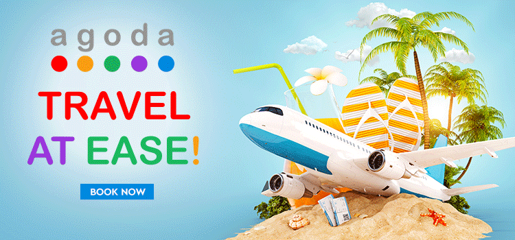
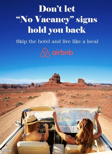
Are banner ads effective? Yes, if they reach the target audience and are correctly designed. One of the tricks is to add call-to-action to motivate users to click on the banner and commit to the desired action such as subscribe to the newsletter, visit the site, get a discount, etc. Here is an example of the CTA button on the Airbnb website.
Most often, CTAs work better when designed as a button. Even though the whole banner is usually clickable, a button still pushes users to action faster.
To design a CTA, make sure that the button is:
Calls with personal pronouns (you, we, me, etc.) entice clicks better. For example, instead of “Request a call back” you can use the phrase “Call me back” to personalize the offer.
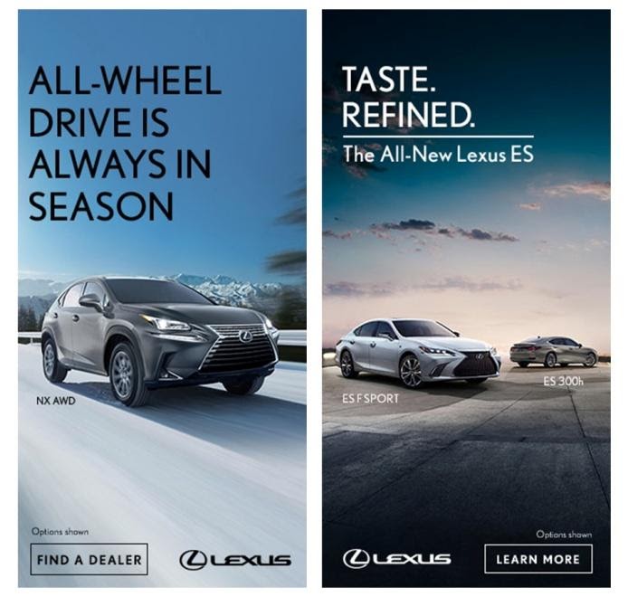
Pictures in banners are usually small, often very small, so you need them to reflect the essence of your offer. For example, if you advertise sports clothing, show one outfit instead of the whole collection.
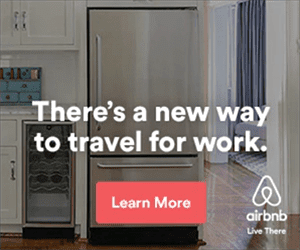
Furthermore, try to not make the picture and the text overlap, otherwise it’ll be hard to perceive. In the example below, you can see that the text is placed against the solid color background.
Pictures are not always required for creative banner displays. Strong text and good typography work just as well.
Here are some more tips to improve your conversion.
First, you can play with banner sizes and types. In addition to standard banners, pay attention to the following sizes:
Second, go beyond static options and try GIF, animation and interactive ads. Animated banners can be more effective than static ones, only if the animation does not distract from the main message. Use simple animations for no more than 15 seconds and three repetitions with the CTA as the final frame.
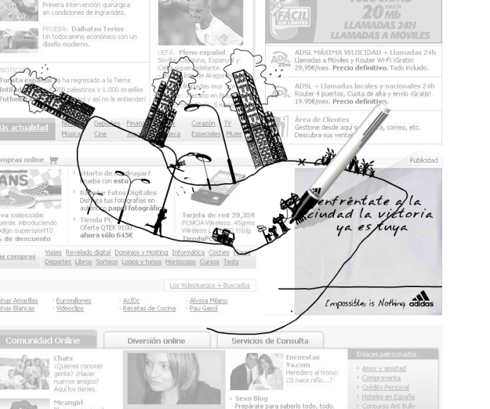
For instance, ADIDAS implemented one of the display banner best practices with the motto “Nothing is impossible.” The user can draw with a felt-tip pen in a banner to expand the place for a little man to run, later various decorations appear—buildings, cars and vegetation.
Third, don’t deploy too many elements and go with:
Fourth, prepare the landing page where the banner will lead users. Don’t make them wander around the site in search of the product and direct the audience right to the offer page. Also, make sure to design the banner and website or landing page in the same style, otherwise it might increase the bounce rate.
Fifth, if you use services like Google, you won’t have much control over the placement. If you plan to post on specific websites, applications or email newsletters, study them and take into account their design. First, you need to pay attention to the contrast since the color of the banner should correspond to the corporate identity of the company and be noticeable on the site. This will allow you to break through banner blindness.
Some more useful ideas:
Banner advertising has long been one of the best channels for attracting customers and making sales. To stand out, you need to deploy the best practices, be creative and follow trends. Whatever strategy you use, try to promote one offer on one banner, add your logo to increase brand awareness and CTA to entice clicks, and run A/B tests with different banners to find the highest-converting options.


